Civilization VII's Deluxe Edition launched just yesterday, and the internet is already buzzing about its UI and other perceived shortcomings. But is the criticism justified? Let's delve into the game's interface, examining its elements and determining if the online outcry is warranted.
← Return to Sid Meier's Civilization VII main article
Is Civ 7's UI as Bad as They Say?
Early access players of Civ 7's Deluxe and Founder's Editions have already voiced strong opinions, particularly regarding the UI (and other missing quality-of-life features). Before joining the chorus of criticism, let's objectively assess whether the UI truly lives up to the negative hype. We'll dissect the interface piece by piece, evaluating it against the standards of a well-designed 4X game interface.
What Makes a Good 4X UI?
While some argue for objective standards in 4X UI design, the reality is more nuanced. A game's context, style, and goals influence UI effectiveness. Therefore, evaluation should be case-specific. However, common design principles consistently appear in successful 4X UIs. Let's use these principles to judge Civ 7's UI.
Clear Information Hierarchy
A clear information hierarchy prioritizes accessibility and relevance. Frequently used resources and mechanics should be prominent, while less critical features remain easily accessible. A good UI doesn't display everything at once; it organizes information logically.
Against the Storm offers a strong example. Building info menus, accessed via right-click, are tabbed for clarity, prioritizing common actions (worker assignment, production) in the default tab, and relegating less frequent functions (inventory, Rainpunk system) to subsequent tabs.
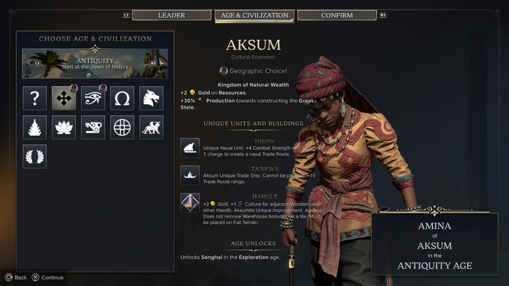
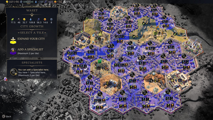
Let's analyze Civ 7's resource summary UI. It functions, but not optimally.
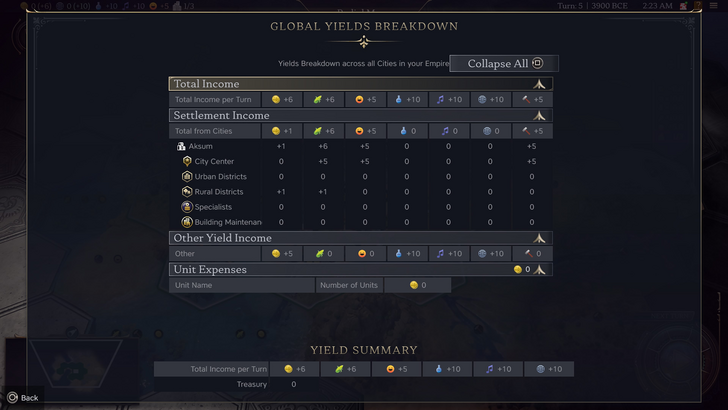
The summary displays resource allocation, neatly separating income, yields, and expenses via dropdowns. Its tabular format is efficient, offering detailed breakdowns. However, it lacks specificity. While total resource yields from Rural Districts are shown, the exact contributing districts or hexes aren't identified. Expense breakdowns are also limited.
Civ 7's resource UI is functional but could benefit from greater granularity.
Effective and Efficient Visual Indicators
Effective visual indicators—icons, colors, overlays—convey information quickly without relying on text. A well-designed UI uses these elements to facilitate rapid data processing.
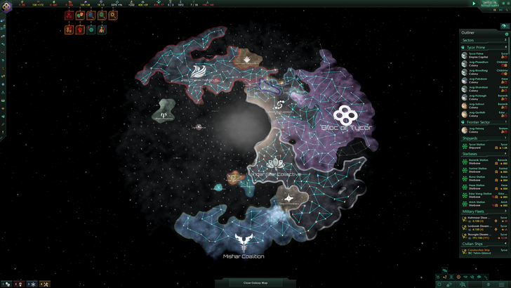
Stellaris, despite its cluttered UI, showcases effective visual indicators in its Outliner. At a glance, players understand ship status (transit, scanning, etc.). Icons indicate colony needs, minimizing clicks.
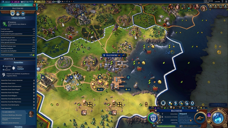
Civ 7 uses iconography and numerical data, incorporating visual indicators like tile yield overlays, settlement overlays (color-coding hex viability), and settlement expansion screens (distinguishing tile types).
The main criticism is the absence of certain Civ 6 lenses (appeal, tourism, loyalty). The lack of customizable map pins is also noted. While not terrible, Civ 7's visual indicators could be improved.
Searching, Filtering, and Sorting Options

Search, filtering, and sorting options are crucial for managing information overload in complex 4X games. Search bars, visual filters, and sort buttons streamline navigation.
Civ 6's robust search function is a prime example, allowing players to locate resources, units, and features on the map. Its Civilopedia links directly to in-game elements.
Civ 7 lacks this vital search function, a significant usability issue. This omission is a major drawback, especially considering the game's scale. Hopefully, Firaxis will address this via future updates.
Design and Visual Consistency
UI design and visual consistency are paramount. The UI's aesthetic contributes significantly to the overall player experience. Even strong gameplay can be undermined by a poor UI.
Civ 6's dynamic, cartographical style seamlessly integrates with its aesthetic, enhancing the overall experience.
Civ 7 adopts a minimalist, sleek design, prioritizing refinement over vibrant visuals. The restrained color palette aligns with its aesthetic, but its subtle thematic direction may not resonate with all players. This lack of immediate clarity contributes to mixed reactions. Ultimately, UI aesthetics are subjective.
The Verdict: Not the Worst, But Room for Improvement
Civ 7's UI, while not exemplary, isn't as disastrous as some claim. The absence of a search function is a significant flaw, but not game-breaking. Compared to other issues, the UI's shortcomings are relatively minor. While visually less striking than some competitors, it possesses strengths. With updates and player feedback, it can improve significantly. Its current state doesn't warrant the extreme negativity it has received.
← Return to Sid Meier's Civilization VII main article
Sid Meier's Civilization VII Similar Games